
Role
UX Researcher
Product Designer
Duration
6 Months
Tools
Figma, Dovetail
Overview
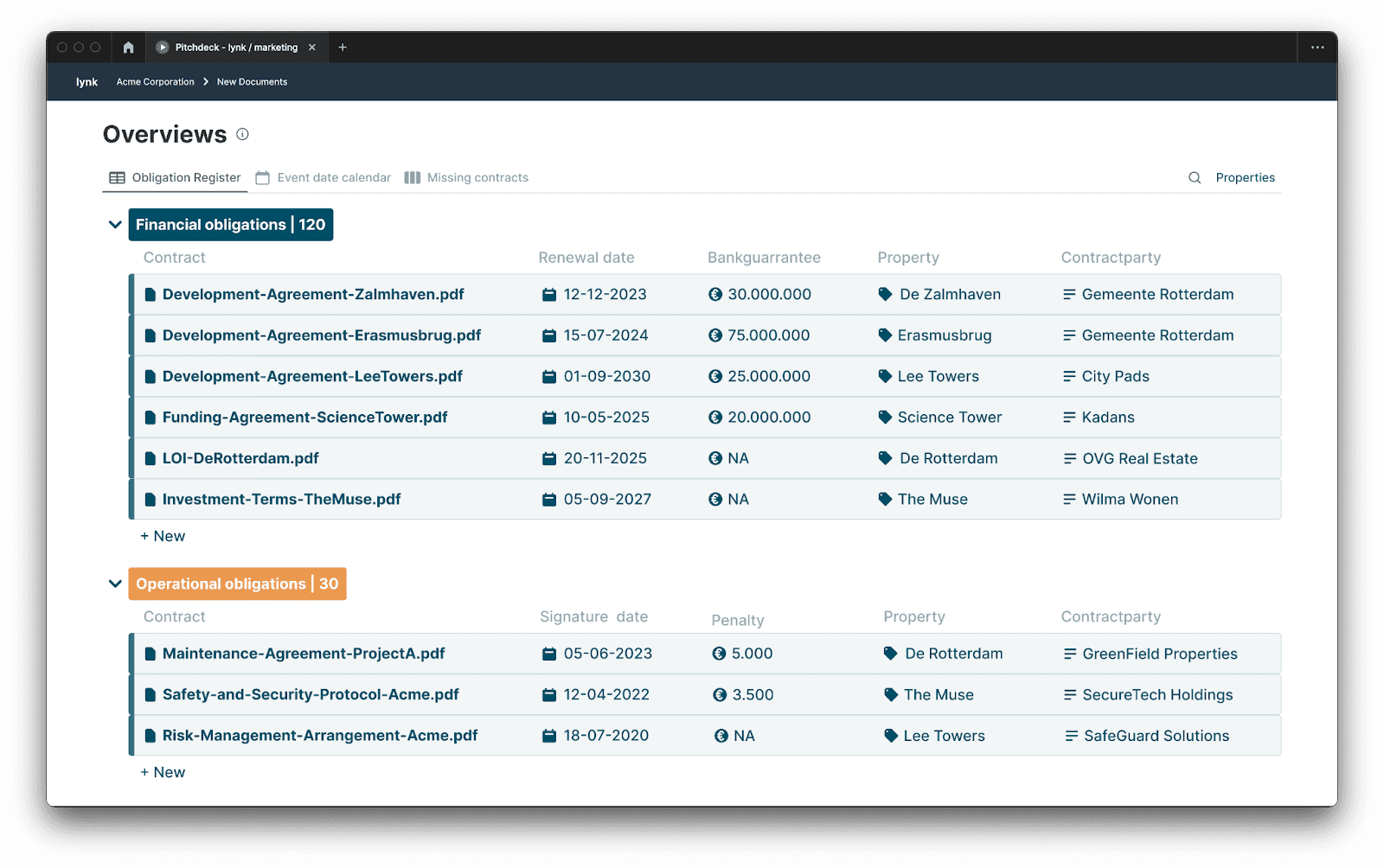
Lynk is a B2B SaaS platform specializing in contract management. It helps organizations streamline and gain insight into their contracts, highlighting key details such as risks, obligations, and deadlines. This enables businesses to efficiently manage their contracts within a centralized knowledge base, which is particularly valuable for industries with numerous long-term agreements where lack of clarity can pose significant financial risks. Lynk aims to minimize these risks.
The effectiveness of Lynk relies heavily on the quality of contract data, specifically the summarization and extraction of critical information through labeling. User feedback highlighted the need for improvements in the usability of the Annotator tool (used when opening a document in a new tab). The redesigned Annotator should make it easier to add labels and comments, including:
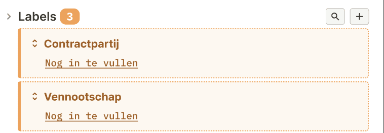
Labels within a document (i.e., labels on highlighted text/information, referred to as ‘snippets’)
Labels on a document (i.e., labels applied to the entire contract without specific highlights)
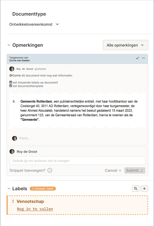
Comments on a labelComments without labels
BEFORE

AFTER

1. Strategic Analysis
This project began with a strategic session where we identified underlying issues and defined the key design challenges. By analyzing user data, we gained a clear understanding of how labels and comments were previously used and their intended purposes. Based on these insights, several crucial product decisions were made, and we determined what the ideal workflow should look like.
⚡️ Design Challenges
How might we make the labeling process more intuitive and efficient, so users can easily assign labels to important contract details with minimal effort?
→ Why? Users currently use labels infrequently and incorrectly, leading to numerous support issues. An intuitive product could increase Lynk's usage and effectiveness.
How might we encourage users to use templates and ensure that all expected labels are applied?
→ Why? The strength of Lynk lies in its labeling functionality, and maximizing this feature will help users get the most out of the platform.
How might we provide users with a clear and cohesive overview of labels, comments, and references within a document?
→ Why? A clear overview will aid in locating important information and contribute to an easier navigation of the platform’s features.


2. The Ideal User Flow
In the strategy session, we mapped out the ideal user flow as follows:
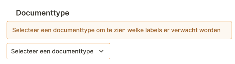
Select Document Template by choosing a document type.
Fill in Missing Labels and Summarize Important Information.
Review Labels for accuracy and completeness.


3. Design Exploration & Prototyping
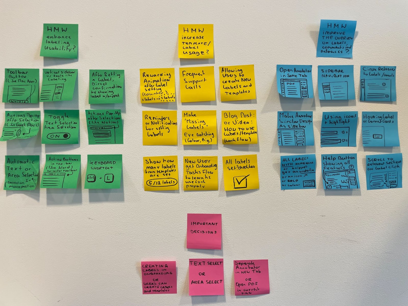
Before diving into the UI design, I explored potential solutions through a brainstorming session. This session focused on identifying possible interactions to be used in the prototypes. The three design challenges formulated in Phase 1 served as the starting point for this brainstorming. The ideas and solutions generated were later discussed with the team and served as inspiration for the final designs. I created interactive prototypes to test new product ideas and validate these concepts.

4. Usability Testing & Iterations
To determine if the changes in the design were genuinely valuable improvements, we conducted usability tests. We invited four end-users to test the prototypes, allowing us to make adjustments based on their feedback and observations after each session. The usability tests were recorded and thoroughly analyzed in Dovetail. This enabled us to focus on observations such as facial expressions, mouse movements, and other non-verbal cues that are often missed during live testing. All observations were summarized through quotes and short video clips, and the insights gained were used to iterate and refine the design.
Results
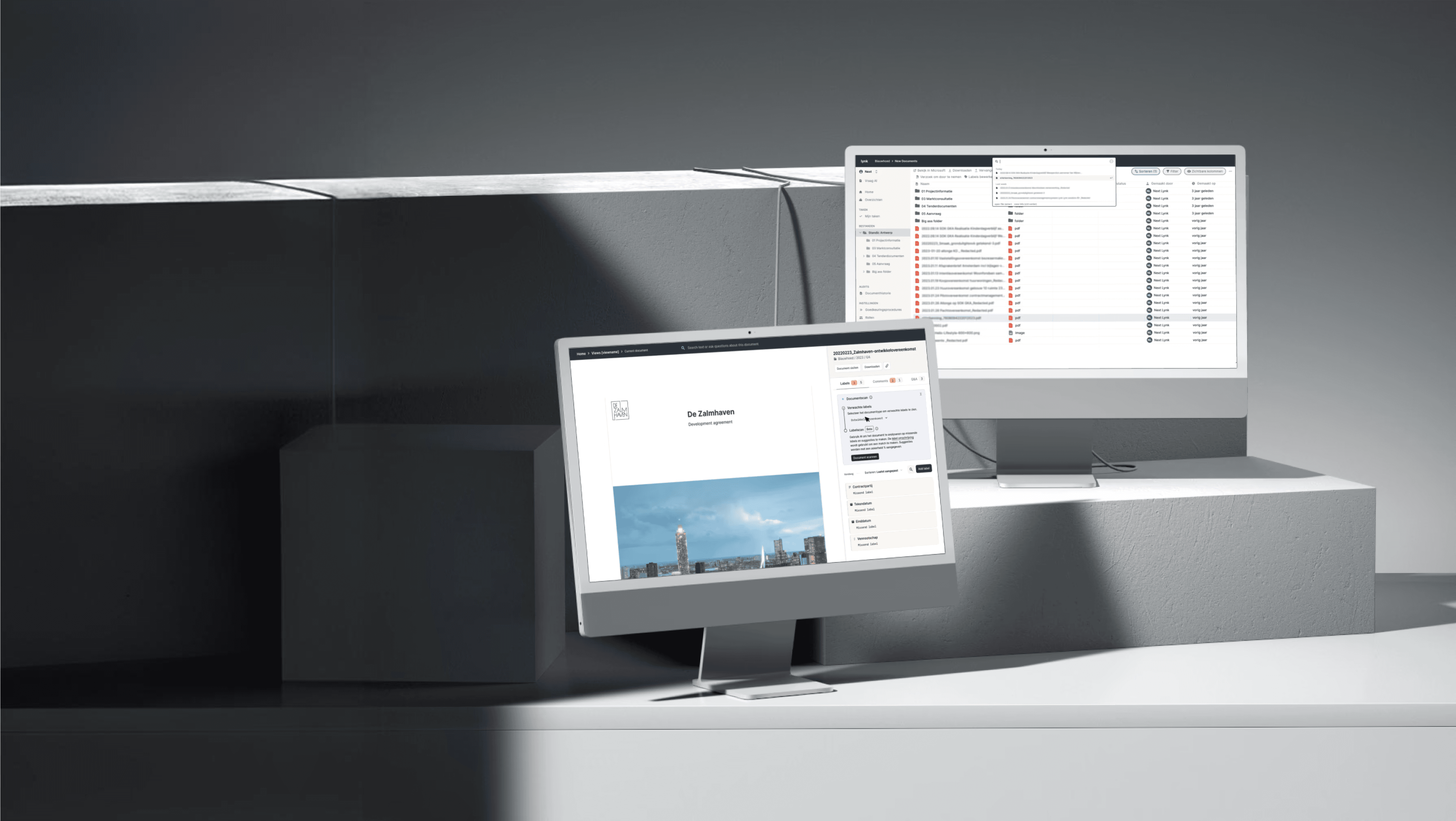
After numerous iterations on the prototypes and incorporating feedback, the result was a new design for the Annotator. This design was developed through extensive iterations and collaboration within the entire design team. In addition to improving usability, the design also received visual enhancements, and the mockups are now being used for marketing purposes, such as in pitch presentations. Following the development of this design, pilot users provided positive feedback, noting an increase in the use of labels and comment features, as well as a rise in the number of processed documents.
Many improvements were made across various user flows, making it challenging to showcase everything. The key outcome is that users now find it easier to process documents and retrieve information. Here are some snapshots illustrating these product improvements:
Adding labels or comments to a specific highlight (snippet) has become easier with the new feature that displays a popup immediately when you select a text area.

Users are nudged to select document templates as the button is highlighted in orange, allowing them to immediately fill in any missing labels.
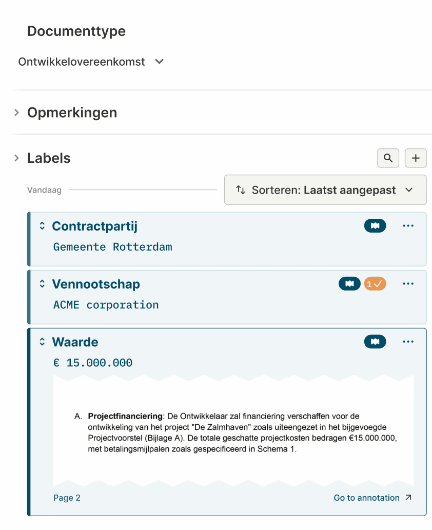
The sidebar provides an overview of all labels and comments, along with their corresponding snippets. This makes it easier to locate information and allows for direct verification of the relevant source location. Comments now have their own dropdown menu and are separated from labels to reduce complexity.

Ready to make something special?
CONTACT ME
CONNECT