Noorderlicht Energy Management App
Role
Product Designer, UX Researcher
Duration
10 Weeks
Tools
Figma, Miro, Dovetail

Helping people get the most out of their solar energy
Designing an experience that is user-friendly and engaging to help people manage their home energy efficiently ✨
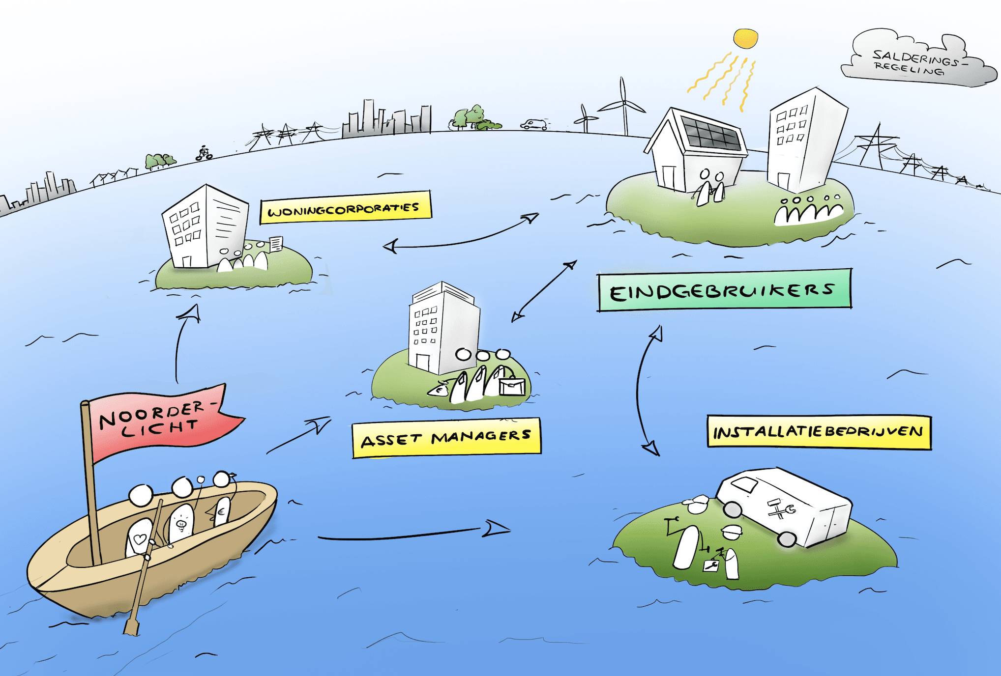
Noorderlicht Ventures is a platform that enables installers, housing corporations, and other asset owners to manage and optimize appliances and energy consumers based on solar-powered energy and dynamic hourly prices.
During my Bachelor Final Project at Delft University of Technology, I worked for 10 weeks on designing their mobile application from scratch as a UX/UI Designer and Researcher.

Context
Let's do a quick overview :)
Noorderlicht Ventures is developing an Energy Management System to help homeowners better manage and use solar energy, aiming to boost self-consumption from 30% to 70% and support the energy transition. Their design brief calls for a solution that enables smart, responsible energy use for a sustainable future.
Why? In the Netherlands, homeowners with solar panels often generate more energy than they use during the day, feeding the surplus into the grid through net metering. This has led to grid congestion and a reliance on less sustainable energy sources, slowing the renewable energy transition. In response, energy providers are charging fees for surplus energy, and the government plans to phase out net metering leading to higher energy bills.
Project Brief
Business Goals
Provide insight into the household energy consumption and usage.
Provide insight into the personal use of self-generated solar energy.
Encourage users to make more use of their own generated energy
⚡️ The Challenge
"Conceptualize and design a user interface that provides insight into energy usage and positively encourages sustainable behavior. "

DESIGN PROCESS
This project follows a triple diamond proces. As the name suggests, this process consists of three diamonds each with a diverging and a converging phase.
ANALYSIS (why)
The first part is about exploring the context and finding the right problem to solve: Discover & Define.
IDEATION (what)
The second part focuses on finding solutions for this defined problem:
Ideate & Decide.
CONCEPTUALISATION (how)
The third part focuses on finding out how to conceptualise this solution:
Develop & Deliver.
ANALYSIS
Through stakeholder mapping, competition analysis, and 6 in-depth user interviews, I was able to redefine the design direction based on key research insights and the primary "jobs to be done."
Key findings included:
The majority of users (4 out of 6) find the data in their current EMS application overwhelming and difficult to interpret.
Users have three main goals: monitoring energy usage, controlling their energy systems, and learning about their solar panels to reduce costs.
Simplicity emerged as a critical factor for users.
(name censored)
(name censored)
(name censored)
(name censored)
(name censored)
(name censored)


IDEATION
Using 'How Might We' questions, Crazy Eights, and Explorative Sketching, I thoroughly explored the design space to discover creative solutions for home energy management.
The most promising concept was a 3D visualization of energy flow, which replaces complex graphs and numbers with a more accessible, intuitive representation. This approach allows users to easily see where energy is coming from and how it’s being used, reducing the need for complicated charts. Other ideas included gamification elements, community-based energy systems, and supportive services.
CONCEPTUALISATION
The third and final phase was the most critical, involving numerous decisions and iterations. Building on the research insights and design ideations, I developed storyboards, user flows, wireframes, and interactive prototypes. I continuously refined these designs based on feedback from user testing and design reviews, working closely with two senior designers I connected with through adplist.org.


USER TESTING & ITERATIONS


Results
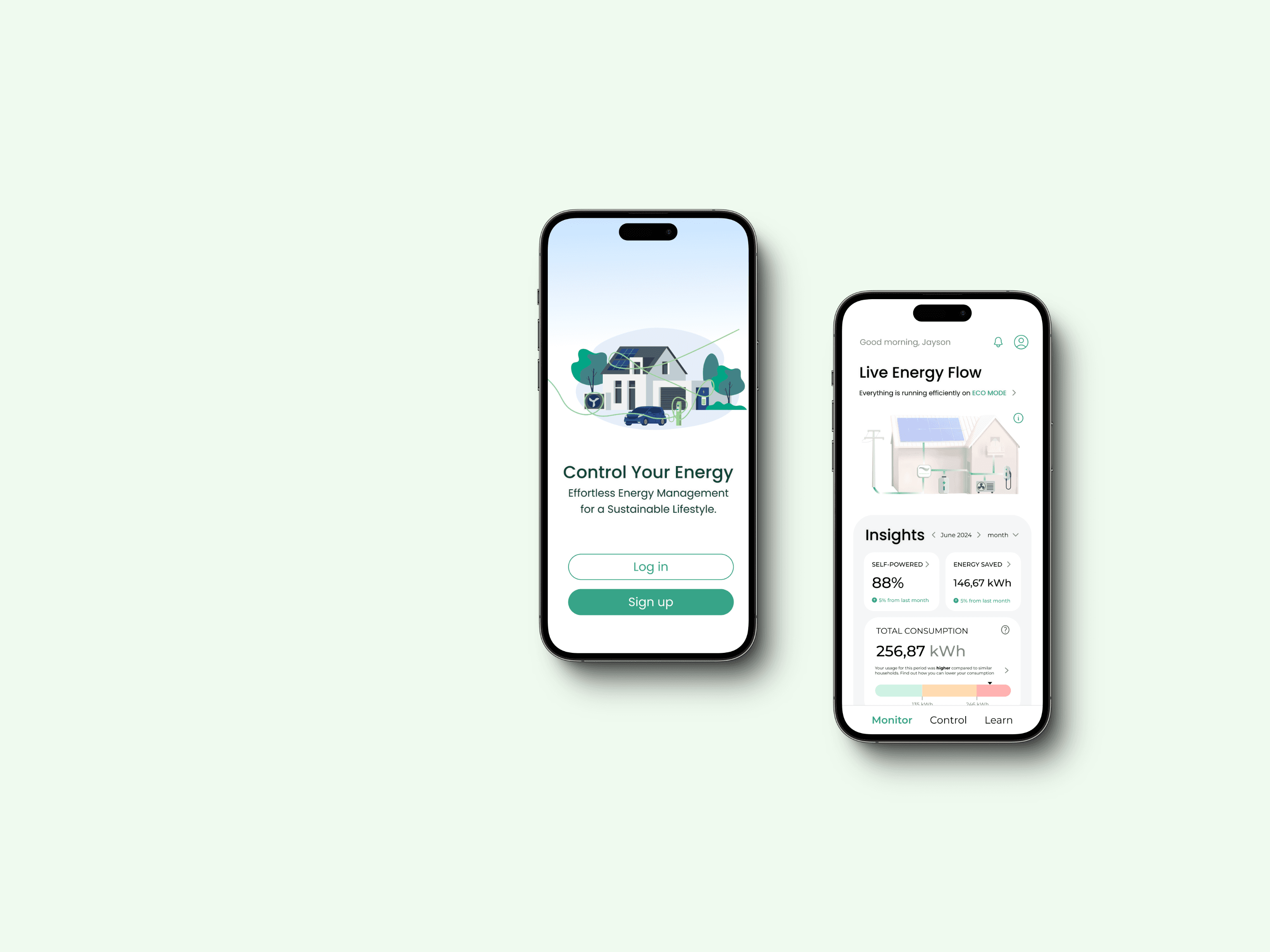
After several rounds of feedback and revisions, I've completed the design for the mobile app, ready to move into development. The design has easy-to-use navigation, so users can easily transition between different sections based on their goals. It also includes intuitive visuals that make complex data easier to understand. With a clear visual hierarchy, the most critical information stands out immediately, while additional details are available for those who want to dive deeper. The whole experience is centered around monitoring, controlling, and learning, all presented in a simple, user-friendly way to keep things from feeling overwhelming.

What I learned
🤝 You are not the user.
Don’t assume others think or interact the same way you do. You are not the user, and the only way to validate your assumptions is through iterative testing with real users. In this project, I applied user-centered design methods from start to finish, ensuring that I remained unbiased and actively included end users throughout the design process.
🌟 Solve the underlying problem, not the symptoms
Getting to know what the user needs and exploring the problem is much more important than just starting to rush without a goal. It deserves to spend time coming with some diverse solutions.
⚡️ Prototypes don't have to be pretty, speed is key
Given the tight deadlines, I focused on prototyping, testing, and iterating quickly rather than perfecting Figma prototypes. This approach allows for more iterations and ensures that the final design is both valuable and intuitive for users.
Ready to make something special?
CONTACT ME
CONNECT